Font and Filming
Font
OMG our title... What could match our script? Our theme?
After brainstorming in class, I came up with what I feel is a pretty clever name to our film. The name my partner and I came up with is "Black Out". It goes along with the dark lighting most horror films carry with them. It also correlates to the boys being targeted while being intoxicates, as well as how the killer shuts off the lights when murdering Dan. Moving on, with the film title, we also need the font for it. When it came to the font we both did some research.
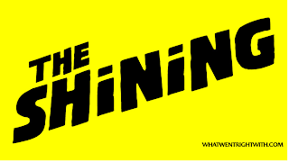
A font is highly key to a film title. Fonts can convey emotion, grab attention, and illustrate what the film is to the audience. I looked at certain fonts and wanted to see the titles that best represented horror and weren't basic. The films IT, Psycho, and The Shinning all had fonts that seemed great! I decided I would come to a conclusion of the font today. I wanted to get it not only out of the way, but also feel like im finally putting a dent into a portion of this project. I think that the color of the font should be black. Im going to list the rest and all of the details to the tittle below..
Color: Black
Font Name: Gothic


Comments
Post a Comment